


Nestlé Allen’s Lollies
Creating ‘bags of smiles’ and childlike wonderment with a packaging design evolution for an iconic Australian lolly brand.
Allen’s lollies (as sweets and confectionery are commonly called in Australia) are a brand as Australian as Vegemite or meat pies. Since 1891 the brand has been a much loved part of Australian life with almost every Australian having a memory of Allen’s from their childhood. The brand design had evolved over time, although certain visual equities had remained more or less constant; an oval Allen’s ‘lolly jar lid’ badge style logo; the distinctive bright red colour; and a fun illustration characterising each product.
The supermarket confectionery aisle had grown considerably since 1891 with a host of brands vying for attention against Allen’s. Whilst Allen’s still retained on-shelf impact (the bright red colour helped!), aggressive competition was eroding market share and Allen’s was beginning to lose relevance with customers.

The packaging brief
Our brief was to refresh the Allen’s brand and remind customers why they should always include a bag of Allen’s in their shopping basket. Our work had to retain (or evolve) the key visual equities, update the product character illustrations and include a ‘window’ on the packaging so that the actual lollies could be seen within each bag.
Little moments of pure joy
Allen's do not just sell lollies. They offer moments of pure joy that give people a magical sense of childlike wonderment. We set ourselves the goal of recapturing this deep-rooted emotional nostalgia that Australian’s have with Allen’s and that they can be relied upon to be a much loved part of their lives no matter what.
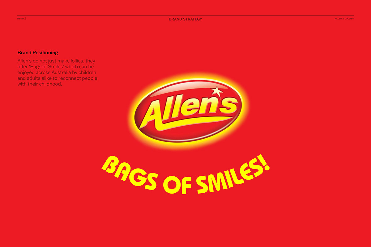
Selling ‘bags of smiles’
We defined this sentiment very simply with our positioning concept that Allen’s offer ‘Bags of Smiles’ which can be enjoyed by children and adults alike across Australia. This idea connects people to moments of joy and nostalgic memories of childhood.

Brand concepts visualised by Tom Collins
A more meaningful Allen’s logo
A smile is a powerful graphic device, but it could not be arbitrarily added. It had to have a reason for being on the packaging. Our idea was to add the smile underneath the Allen’s oval logo, thus creating the abstracted face of a clown. This gave renewed meaning to the Allen’s logo (which became a red nose) with the smile providing a powerful and impactful graphic. What’s more, the smile could double as a transparent product window to showcase the actual lollies inside each pack.


Product characters illustrated by James Briscoe
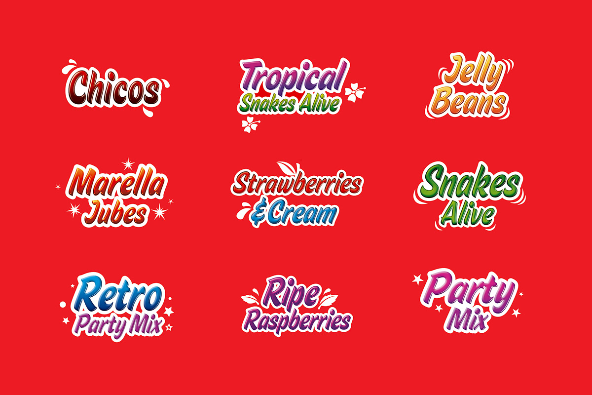
Designed by Tom Collins the typographic style for the products reflects the fun nature of Allen’s lollies

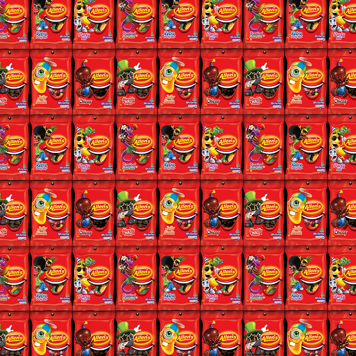
A wall of Allen’s red and bags of smiles
Project outcome
The new design was successfully relaunched and universally accepted by die-hard Allen’s fans. The ‘Bags of Smiles’ brand idea was a meaningful and distinctive brand equity which connected emotionally with consumers. It added value back into the Allen’s badge logo, increased on-shelf impact and created an inspiring platform on which marketing and advertising could be developed.
Acknowledgements
If any team members have been
omitted please click this link
and email the new details.
Project Date
2008
Design
Gary Broadbent Creative Director
Tom Collins Design Director
Illustration
James Briscoe Characters Tom Collins Visualisation
Typography
Tom Collins
Agency
Cowan Sydney
Client
Andrew Potter Director of Comms
Ian Bell Brand Director, Confectionery
Thank you!
Your likes and comments
are much appreciated.
Based in Sydney, Australia
we work on projects big and small
all around the world and we’d love to
talk to you about yours.
For all project enquiries
media and PR requests
or job opportunities, please
get in touch with us.


