


Grow Healthy
Branding / Packaging / Healthy / Bowls / Mai.2018
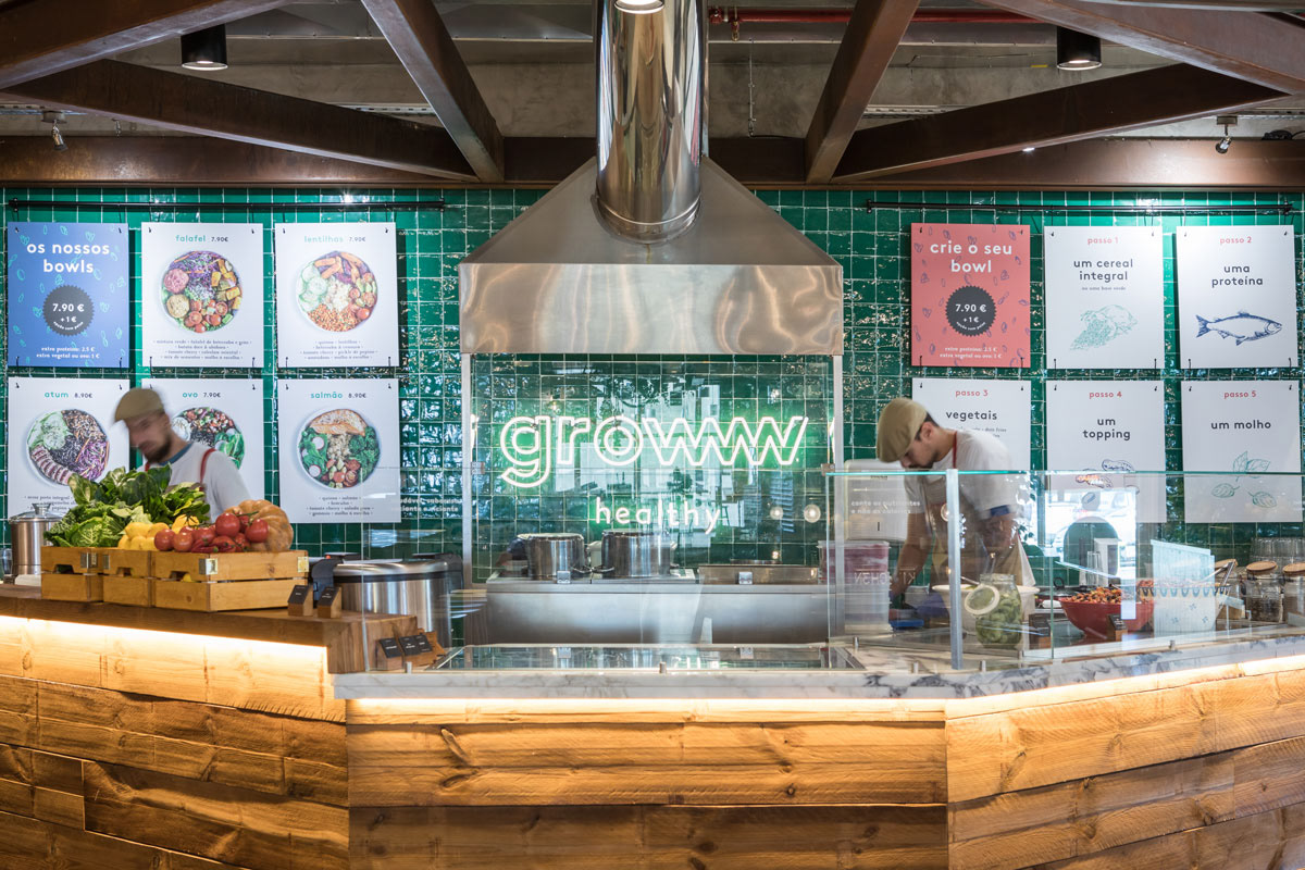
To reflect the meaning of the word Grow, we chose to merge and multiply the letter “W”, in order to create a graphic rhythm suggesting the growth itself.The illustrations give the human and organic feeling to the brand, in contrast with the modern healthy lifestyle.The color system is based on the 3 RGB colors: Green, Blue and Red. Representing the product, and the Cold and Hot Temperatures of how food is served.
Photo credits: Diogo Alves

