
SELECTED
Logos, Marks
& Monograms
2012 – 2017
An selection of different styles of identity marks I have been working on between 2012 and 2017.
The work ranges from experimental and decorative to traditionalist luxury, always with a focus on visual clarity.
© christophruprecht.com studio { at } christophruprecht.com Instagram.com/ @christoph_ruprecht
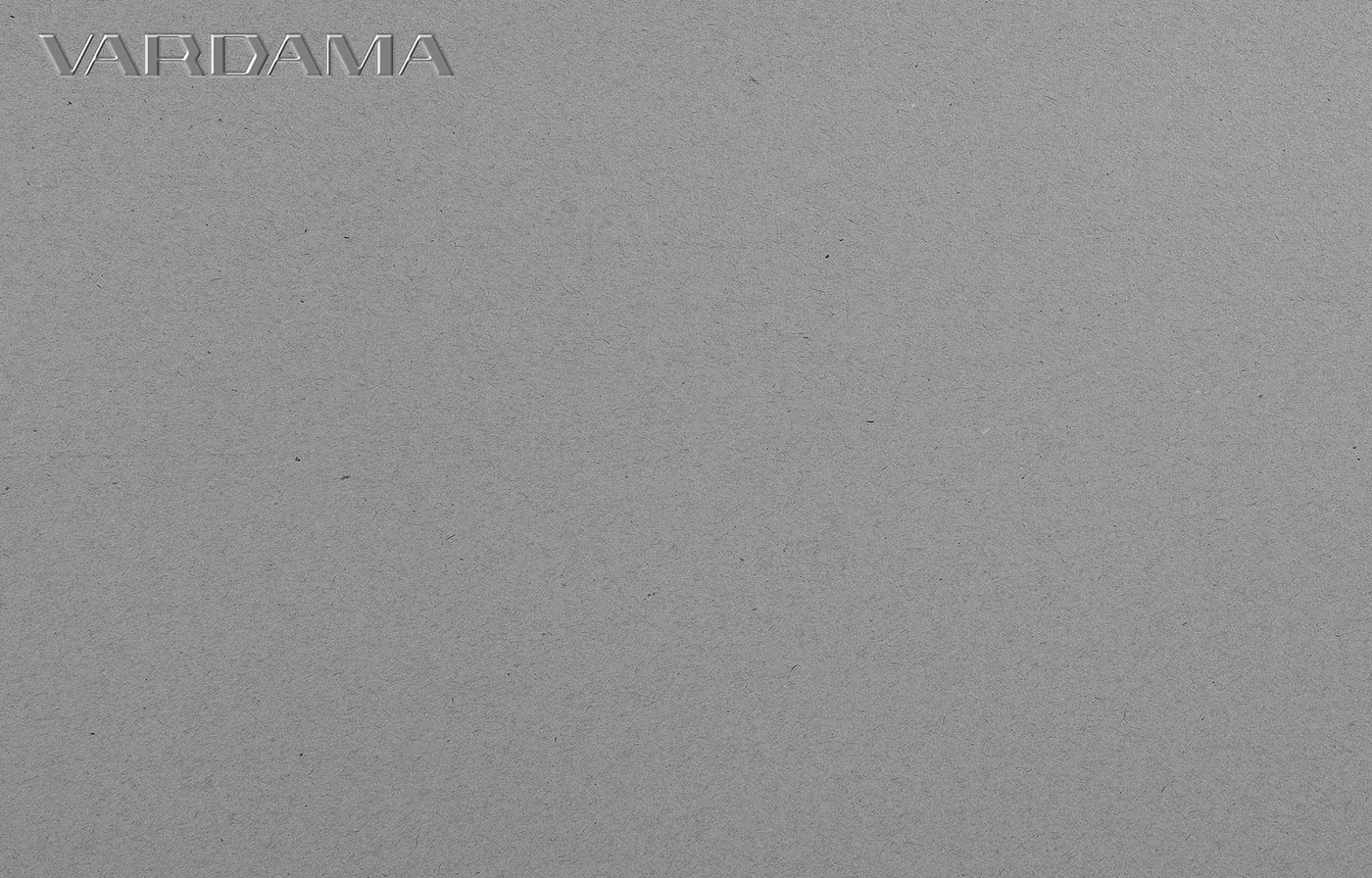
CLIENT
Vardama
MARKET / BUSINESS
Fashion / Affordable Luxury
THE CONCEPT
Vardama is a fashion / technology hybrid, offering a nano-tech infused line of dress shirts, suits and neckties.
We wanted to skip over a millennial start-up type feel and rather go for a bespoke logotype that pays homage
to the classical brands in the luxury market but with a futurist touch. I choose to completely omit any rounded elements
and corners from the logotype and add a sporty, minimalist avatar as an additional element.

CLIENT
eyelab®
MARKET / BUSINESS
Surgical Instruments
THE CONCEPT
Inspired by the oval shape of eyes, and carefully constructed from thin lines,
the logotype reflects the precision of the instruments used in eye surgery.
Lowercase and minimalism give the logo a modern and medical feel.

CLIENT
OPTISURE
MARKET / BUSINESS
Digital Insurance
THE CONCEPT
Bespoke, all caps logotype for Germany's first paperless insurance company OPTISURE.
I wanted the company to reflect a contemporary and premium approach to their branding.
After some early phases they opted for the opposite direction, rounded, lowercase and approachable.

CLIENT
Equa-Tek™
MARKET / BUSINESS
Textile Technology
THE CONCEPT
Equa-Tek™ is the every-day life analogy to Gore-Tex®. It makes standard textiles, ranging from cotton,
to tinsel or silk spill repellent and stain resistant by the means of nanotechnology. The highlight being the
technology does not involve chemicals or coating and leaves the hand feel and breathability
properties of the garment entirely in tact.

CLIENT
V A R T E X
MARKET / BUSINESS
Tech-infused Workwear
THE CONCEPT
Science and Technology meet modern work wear at Vartex. From the medical,
to the hospitality industry, garments are infused with a proprietary formula that
makes the textiles hydrophobic and stain resistant.
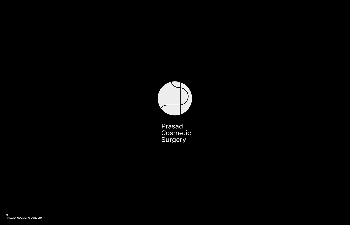
CLIENT
Dr. Amiya Prasad
MARKET / BUSINESS
Cosmetic & Reconstructive Surgery Clinic
THE CONCEPT
Needle and Thread forming a P – Exact and refined the fine line work
reflects the needed precision for cosmetic surgery. Paired with a typeface that feels
technological, human and high end.
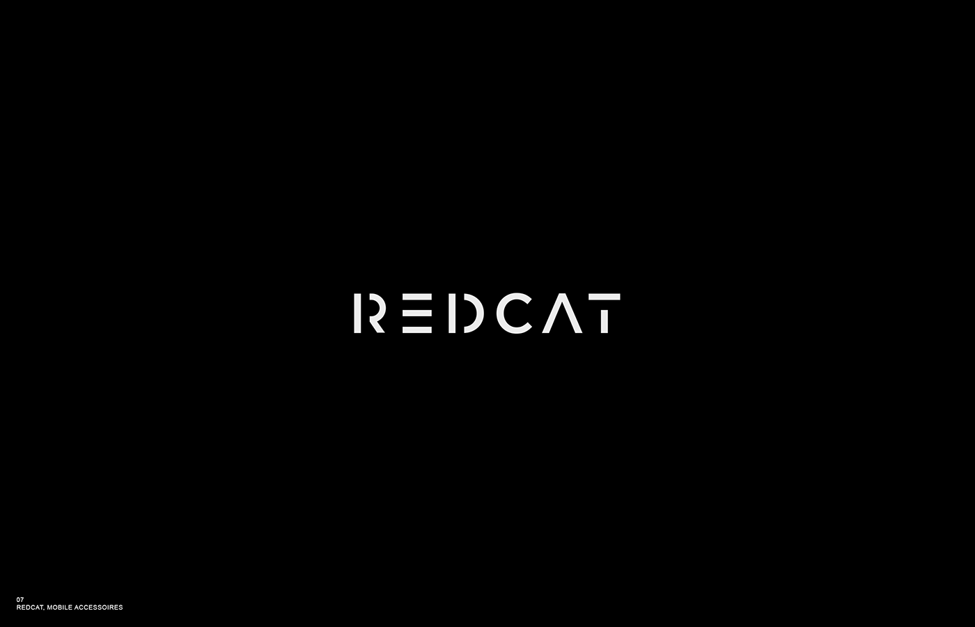
CLIENT
REDCAT
MARKET / BUSINESS
Mobile Phone Accessoires
THE CONCEPT
RedCat is a mini startup, selling display cases for iPhones.
I wanted the logo type to be as playful as the name. The geometric simplicity and gaps
enable the word mark to be punched through the various materials of the cases.

CLIENT
Jonas T.
MARKET / BUSINESS
Life Coach
THE CONCEPT
A 12x12 grid inspired by vector fields serves as the basis for this dynamic
logo systems. Various scenarios, tendencies and stories can be told
by adjusting the angles of each element.

CLIENT
Napfgold
MARKET / BUSINESS
Artisan Dog Food
THE CONCEPT
A regional company specialized in hand made dog treats.
Napf (=bowl) A Touch of black forest and traditionalism with a stylized bone.

CLIENT
Heimat
MARKET / BUSINESS
Night Club
THE CONCEPT
One of many bespoke logotypes I developed for a local night club.
This one has a soft asian touch.

CLIENT
Vision Key
MARKET / BUSINESS
Consulting
THE CONCEPT
A cryptic approach to a visual mark. Unlocking new visions and perspectives.
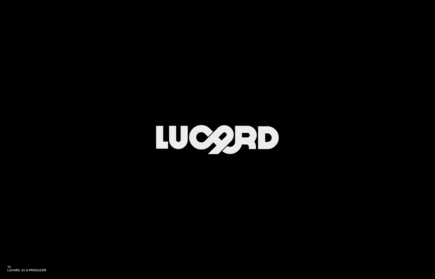
CLIENT
Lucard
MARKET / BUSINESS
Producer, DJ
THE CONCEPT
The client wanted to have a bold, typography only logotype.
I delivered this bespoke solution among some others.
CLIENT
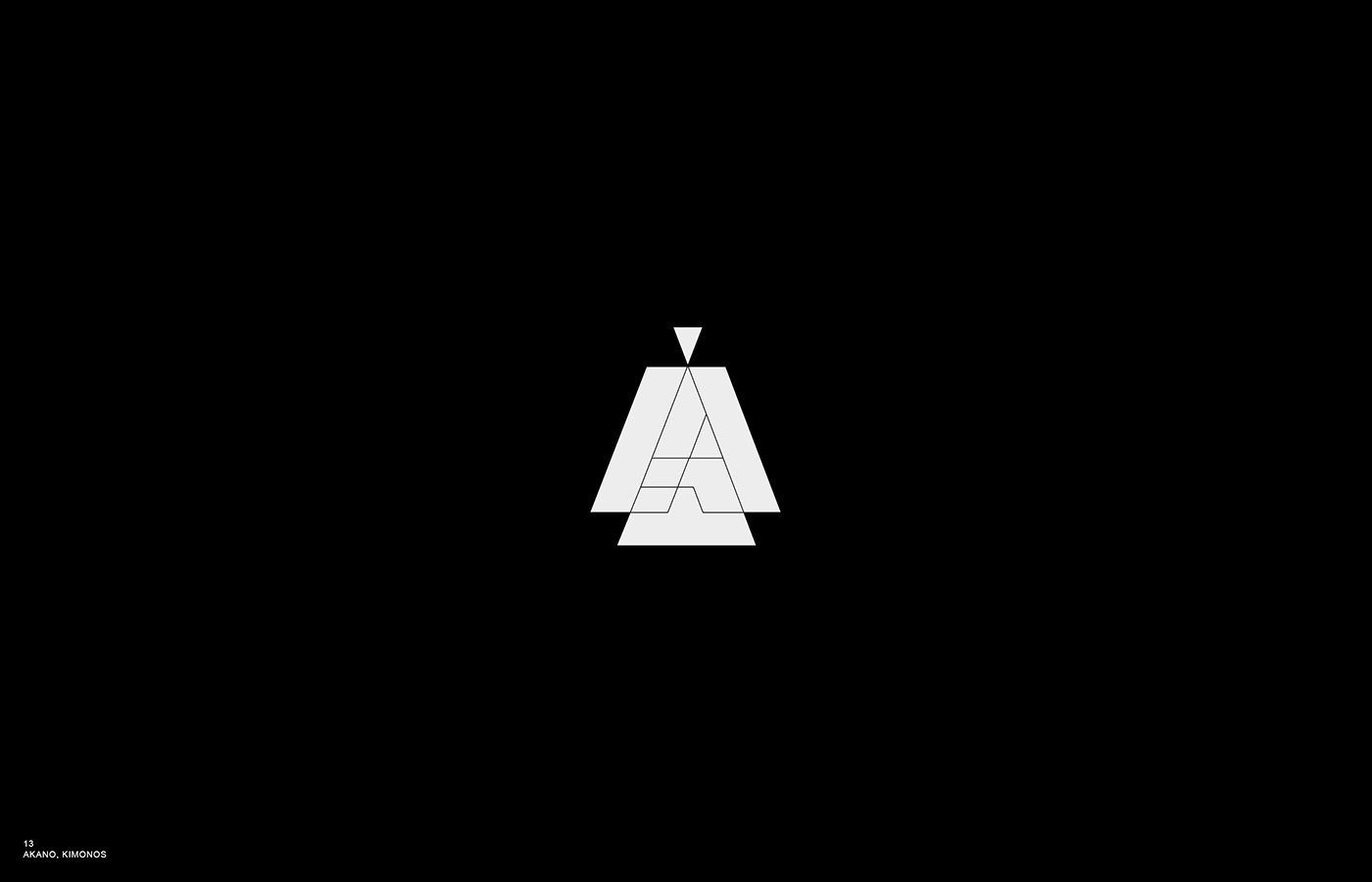
A K A N O
MARKET / BUSINESS
Kimonos
THE CONCEPT
A stylized Kimono silhouette with an abstract A forms the basis for a dynamic logo
system where the A is illustrated in various ways.
CLIENT
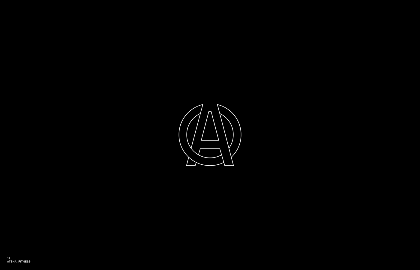
A T É N A
MARKET / BUSINESS
Fitness & Nutrition
THE CONCEPT
Simple monogram suitable for social media profiles.
CLIENT
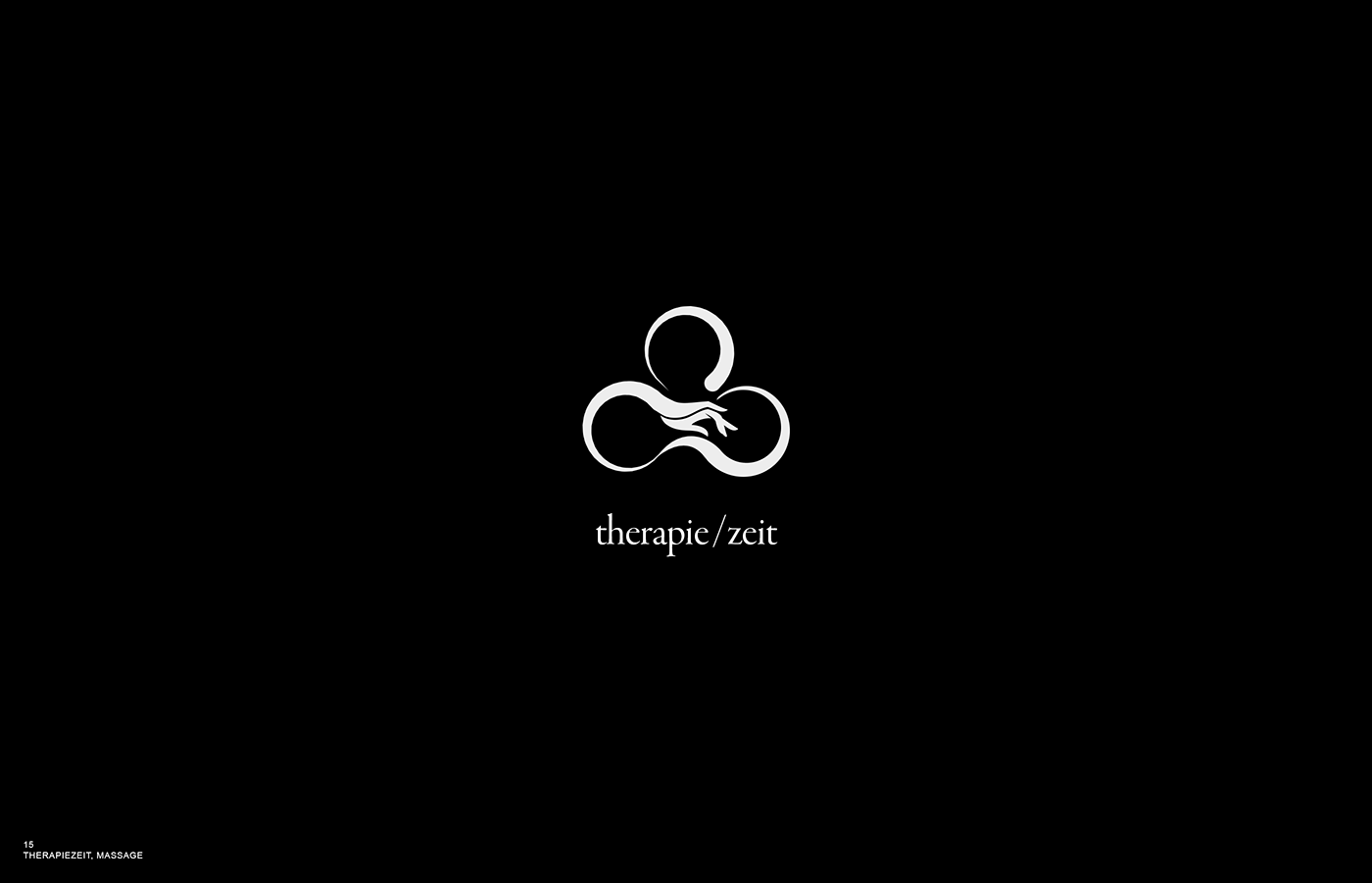
TherapieZeit
MARKET / BUSINESS
Wellness & Massage
THE CONCEPT
Zeit (= Time). Hands on Body. Forgetting time, finding relaxation.
Two owners, one studio.


