


BARROCA
Branding / Contemporary / Exhibition / Structure / Mar. 2016
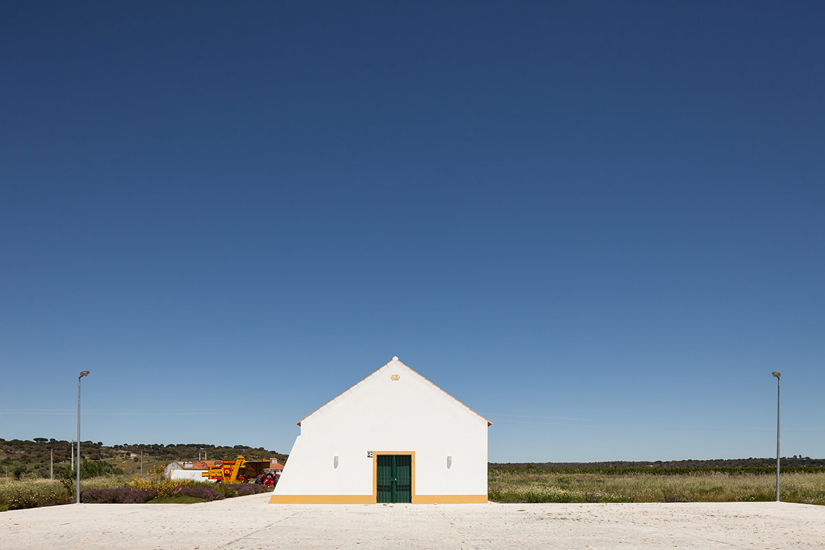
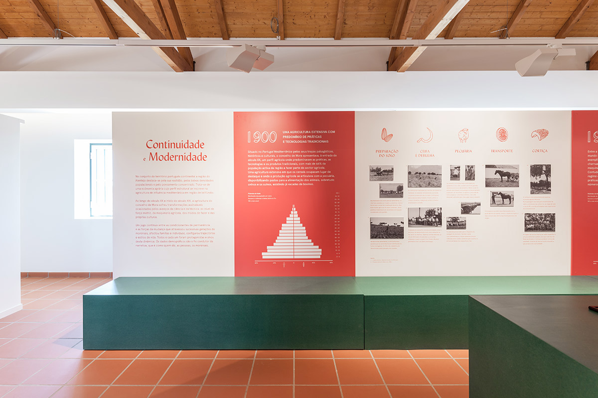
Starting from the physical and socio-cultural context of the region that surrounds the Herdade da Barroca, we intended to develop a contemporary and versatile identity, whilst respecting the cultural roots of Mora. We decided to develop a typographic logo, together with a symbol, that in certain situations assumes an identifying role for “Barroca”. These two different paths work independently due to the complexity and variety of its media – digital, print, indoor/outdoor, among others.
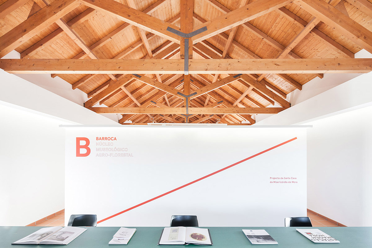
The roof structure was the starting point for the construction of the symbol. We tried to use the contrast between two strong colours, Red & Green which reflect the essential elements of the core and region (field, ceramics, building materials, etc.)
Coordination, Exhibition design: Duarte Caldas – DC.AD / Photo credits: Francisco Nogueira Architectural Photography


