
Fantastic garden –
Visual Identity
Fantastic garden – it is exhibition where contemporary artists will reflect on the ecological and metaphorical meanings of the garden and plants.
For centuries, the garden has been considered a mirror of society, a microcosm in which a person builds relationships with the natural world and the land that he cultivates and which nourishes him. What can gardens tell us about the times in which we live? The works of the artists who will be presented at the exhibition will show how deeply the image of the garden is rooted in our culture and how much it can say about it.
Design Goals
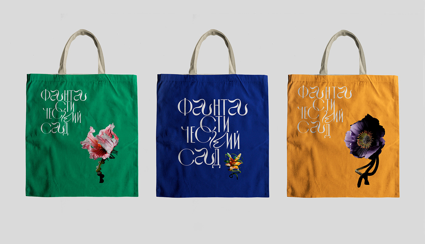
To develop a visual concept of the exhibition that will reflect its theme, and will be able to attract interested audience. The museum wanted some original lettering to be the centre of the visual identity.


Design Solutions
Typography
Santa Catarina — an elegant font, with alternating round and narrow letters, modified with handwritten letters
SK FEMME FATALE — fantastic and unusual font, used for headings
Cormorant Garamond — the main text for typing texts, subheadings
SK FEMME FATALE — fantastic and unusual font, used for headings
Cormorant Garamond — the main text for typing texts, subheadings

Color Palette
Bright colors representing the seasons of the year refer to the cyclical nature of life.
Endless update. The palette is used as a background.
Endless update. The palette is used as a background.


Logo
The logo is based on the original Santa Catarina font. The connecting and horizontal strokes of the letters were thickened for better readability. Handwritten letters A and K have been added to the logo, rounded and flowing, imitating plant roots, emphasizing the connection with natural forms. This combination makes the logo look fabulous and visually embodies a floral motif.


The book «Fantastic Garden» accompanies and complements the exhibition. It contains essays, stories and poems about the influence of gardens and plants on society and culture, written by authors from around the world.


