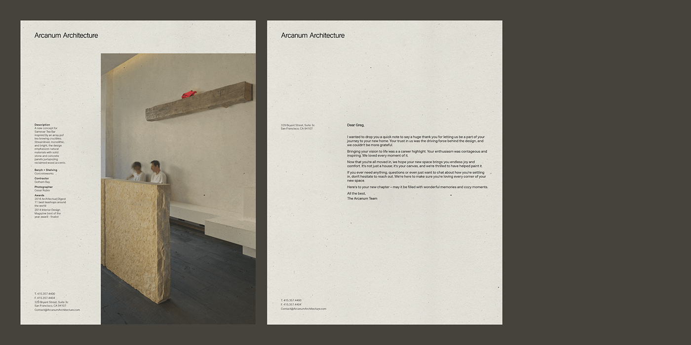
Arcanum Architecture—Brand Identity
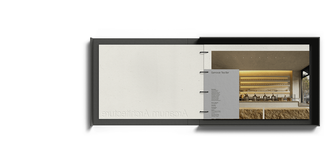
One of San Francisco’s premier architecture firms approached Hybrid Design wanting a brand refresh to better reflect their work. We took an unobtrusive and minimalist approach that allowed their work to shine. With unique type, asymmetrical design, and eye catching materials—this brand is anything but simple.
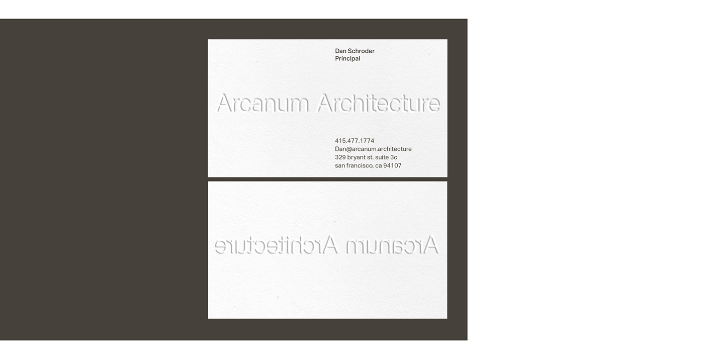
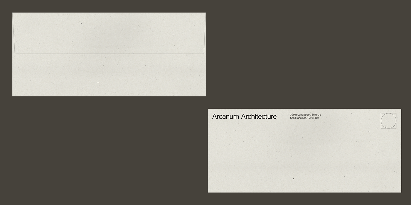
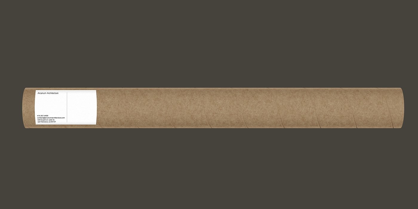
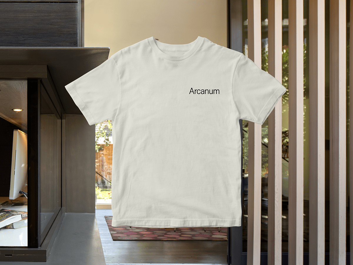
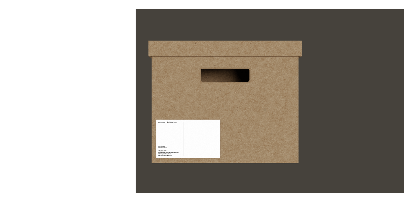
A custom wordmark is built around the keystone of the “A” recreating unique angles found in Arcanum’s work. An emphasis on tactile print material rather than color creates a simple yet rich palette for the brand to exist on. And asymmetrical layout harkens back to the proportions found in their architecture.
—
Studio: Hybrid Design / Hybrid-Design.com
Executive Creative Direction: Dora Drimalas
Executive Creative Direction: Dora Drimalas
Creative Direction: Brett Newman
Design Direction: Olivia Ward
Design: Nick Paff, Nich Barresi