

Selected Logos,
Marks & Monograms
2020 – 2021
© christophruprecht.com studio { at } christophruprecht.com
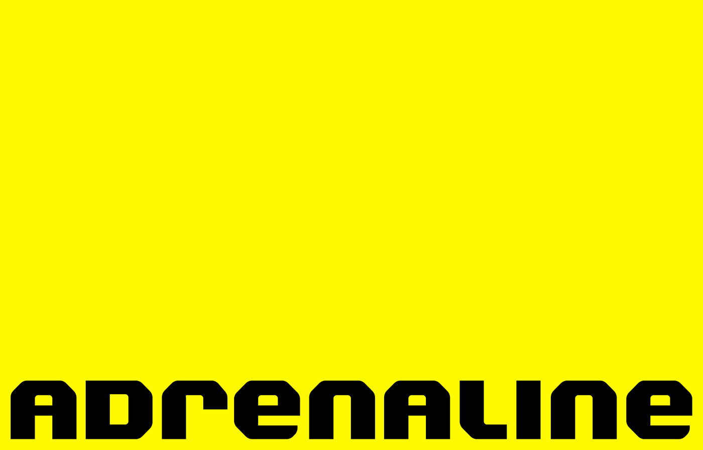
Client: Adrenaline _ Market: Big Data / IT / Live Sports Betting
Adrenaline IP specializes in under-the-hood proprietary analytics and A.I. aided predictions for major sports. This data then finds its way into live betting applications, be they mobile or on site in sporting facilities or casinos. This bold and bespoke word mark is an outtake of the process. I‘m usually not a fan of mixing upper and lowercase letters, but this one didn‘t turn out too bad.

Client: NOBL Group / NOBL LIVE _ Market: Consultancy for the Medical Cannabis Industry / Events
NOBL Group is bringing together a number of industry leading companies, a highly experienced leadership and an aggressive growth strategy; that will unlock the societal, economic and medical opportunities for cannabis data & media. The NOBL portfolio will provide governments, operators and investors the data, knowledge and network that is core to advancing cannabis around the world. The client was looking for something time- and effortless that could sit well above all the company logos it houses under its roof.

Client: NOXX _ Market: Digital Collection and Trading Platform for Sports Cards
NOXX is the ultimate collection management system, collection data visualization and market analytics platform for every sports card collector and investor. By developing a comprehensive set of tools, services, and offerings collectors and investors for the first time can truly understand their collection on one digital platform. By creating an elegant and intuitive interface collectors and investors can visualize their portfolio of sports cards in one place alongside deep broad market analytics, interactive ranking lists updated on a daily basis and collection valuation tools and reports. The bespoke word mark is unapologetically edgy, tech and sporty.
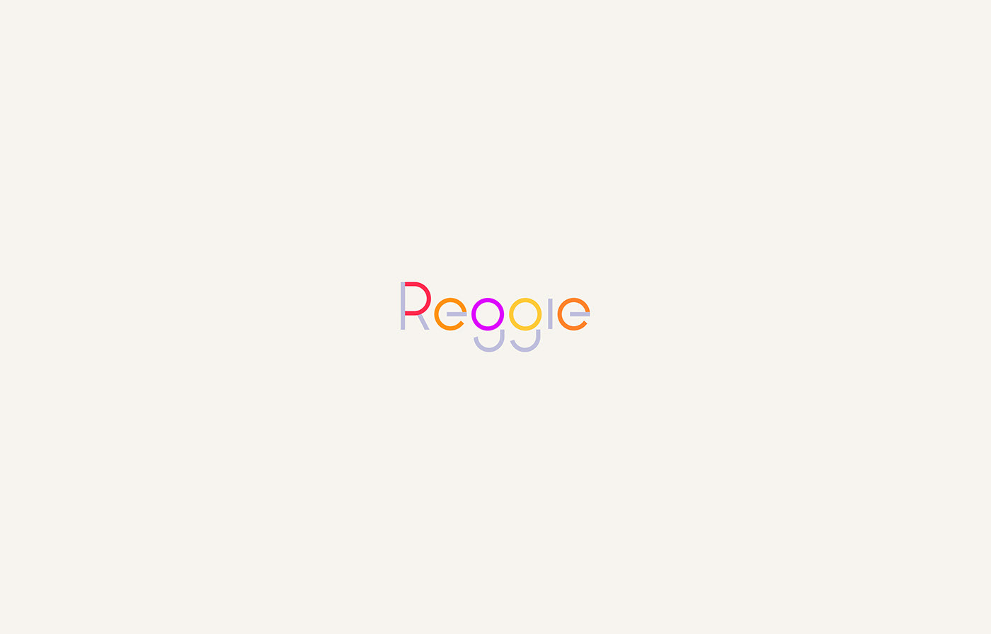
Client: Reggie _ Market: Reggie is an app that helps parents connect their children with fun activities in their area
Reggie is about to change parents’ lives for the better! Reggie is a mobile app with a desktop interface that seamlessly works together to make selecting and signing up for children’s activities easier and faster by streamlining the registration process eliminating one of the most stressful processes for parents. While the client went with a simpler and more organic approach at the end of the branding process the above version was strong second and my personal favorite.

Client: Undisclosed _ Market: Medical Technology
multiplemodern technology-aided medical field.

Client: KF Industrieanlagen GmbH _ Market: Germanys' premier Galvanic Specialists in the Auto-Motive Industry.
The client has been an established player in the field of automative galvanics, serving most notably companies such as Mercedes Benz or Porsche with luxurious parts ranging from grills, to badges to interior elements. The company was looking was for something industrial yet sophisticated and a visual connection to their main market. I‘ve let my self be inspired by super car badges and came up with the above solution for them.

Client: S'Eberle _ Market: Private Real Estate / Architecture
S‘Eberle is a prime real estate project in Stuttgart, the capital of Baden-Württemberg, Germany. The architectural vision was to re-imagine parts of the old facades and roof silhouettes of the originally land-mark buildings it is now replacing. The form language of this entirely custom word mark plays with these elements. Deliberately kept in lower case it is meant to speak to younger investors and feel approachable to the new generation of inner-city dwellers.

Client: LVL _ Market: Medical Cannabis Healthcare and Research Group
LVL‘s mission lies in providing safe, effective and low cost treatments to patients in the shortest time possible to radically improve human health in major disease areas and fulfilling unmet medical needs of patients and offering high quality cannabis medical products to the UK market, as well as achieving public and institutional confidence in cannabis medicines. The strategy team and I came up with the naming and successfully pushed the client towards a minimalist, elegant and future facing word mark.

Client: Level _ Market: Medical Cannabis Healthcare and Research Group
LVL‘s mission lies in providing safe, effective and low cost treatments to patients in the shortest time possible to radically improve human health in major disease areas and fulfilling unmet medical needs of patients and offering high quality cannabis medical products to the UK market, as well as achieving public and institutional confidence in cannabis medicines. The above is my favorite outtake from the process before the brand name was shortened.

Client: Goodplant Ventures _ Market: Venture Capitalist Firm operating in the Cannabis Market
Goodplant invests in companies that are well positioned to shape the future of medical cannabis. Their focus is on highly regulated European jurisdictions where Goodplant seeks out future industry leaders with defensible positions, sustainable business models and stand out management teams, preferably early stage venture type investments. Avoiding any clichéd cannabis symbolism I created a custom visual mark for the client combining their initial G, plant-life and the sun, radiating growth and optimism.

Client: Tapstats _ Market: App for UFC Live Betting / Entertainment
Tapstats is a one-of-a-kind live sports betting app in the field for the Ultimate Fighting Championship that enables their users to predict and bet on immediate actions and overall outcomes of a fight with the help of their mobile phone. Instead of going for a predictable visual mark, the client was intrigued by a more cryptic / data inspired approach that visually sets them apart from any related service offerings in their market.


Client: IML / I am Learning _ Market: Mindfulness in Education
IML / I am learning is both an on- and offline learning environment for international students in the Arabic Emirates that aims to the let mindfulness permeate their curriculum and learning culture. An extensive project that included more than 15 shortlisted approaches to the logo design, two of which are shown above. Color, playfulness as well as a contemporary and universal look, speaking to students and parents from different cultural backgrounds alike, shaped my approach to the designs.

Client: HydroHerb® _ Market: CBD-based Wellness Products
HydroHerb® is a germany based boutique brand that deals in CBD-based wellness products, such as oils, cosmetics and skincare. Hydroherb has at it‘s core a proprietary chemical process that enables them to make their CBD products water solluble, enabling them to introduce a range of flavors that can live in cafes or cocktail bars. Speaking to both older and younger demographics alike, I create the above bespoke word mark for them, positioning them as a matured, yet modern brand.

Client: Oldslip _ Market: NY based tech-focussed Investment Firm
Oldslip is a New York Based Growth Equity Firm Focused on Investing and Operating Privately Held Technology Companies. I dialed the branding back on their logo, creating a semi-traditional word mark that sits firmly and maturely in the finance and investment space. In turn color was used progressively throughout the visual branding, giving them the aesthetic leverage to attract young technology startups.

Client: OpenCannabis _ Market: Politics / Activism / Health
Open Cannabis is the name of a recently run public campaign addressing the NHS and Government to allow for better and safer use of medical Cannabis in the UK. Operating on and offline its aim was to successfully inform potential patients, their peers and regulators of the benefits and unfortunately still existing stigmas surrounding the use of medical cannabis. The campaign itself being quite loud, attention-grabbing and visual, I chose a classical medical look for the logo design - neutral, paired with abstract plant symbolism, leaves are unfolding (opening).

Client: Emirate MedTech® _ Market: Medical Technology and Research
I wanted to created something that spoke both of the tradition of the local culture as well as having a notably forward thinking and iconic look. In the end the client went for a more visual approach but the above was what I believed the most solid and sustainable of the proposed options.

Client: PsychCapital _ Market: Investment Company in the emerging psychedelics healthcare space
PsychCapital identifies, funds and builds UK and European companies in psychedelic healthcare. Their mission is to support a new wave of innovators who challenge the status-quo and revolutionize how society deals with mental health conditions. I‘ve created a visual mark for them, that speaks both to the sector of finance as well as psychedelics and would be used without a designated word mark to further emphasize its iconic and modern nature.

Client: Marisand Suites _ Market: Luxury Accommodation
whimsical and fun aesthetics most notably found in the area.


