
BRIEF
Canthynnus is a new Spanish gastronomy company, offering canned seafood of the highest quality, with a strong focus on the product’s origin. They work with some of the most experienced and recognised suppliers from both Spain and abroad, offering products based on a subscription model, in which the client receives varied seasonal products on a monthly basis.
CONCEPT
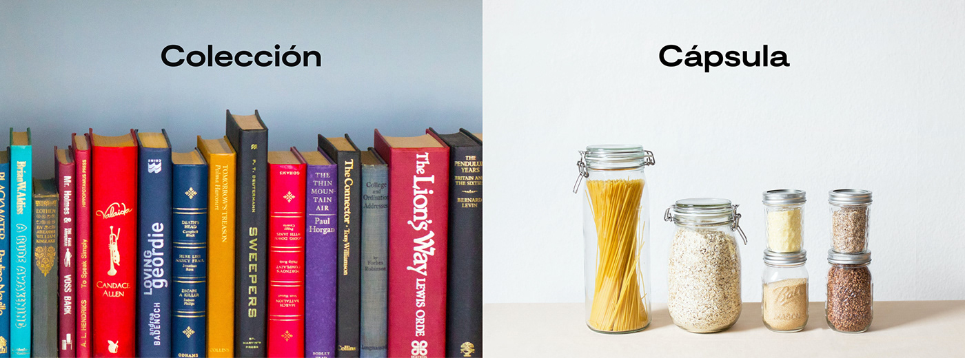
The brand idea for Canthynnus is expressed as a creative concept based on a collection of capsules, driven by the packaging as the brand’s principal entry point. In order to elevate the brand, communicate the aspirational nature of the quality of the product and build the narrative of the subscription model, we created a series of flavour capsules that form a never ending series of gastronomic experiences.


VISUAL IDENTITY
The identity for Canthynnus is built around the attributes of capsule and quality to present exquisite flavours, elevating the brand into communication territories such as those of fashion and the arts. The visual identity combines more human visual codes with other technical aspects that support the confidence in a high quality product. Also, as every can is part of a series, we developed a wide colour palette that can adapt to every new gastronomy experience.
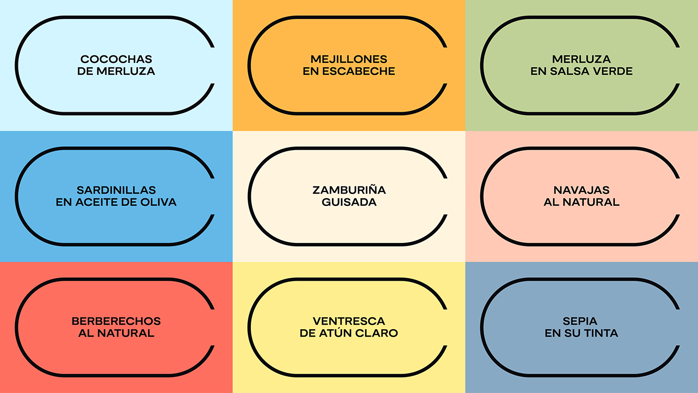
ILLUSTRATION STYLE
Canthynnus is more than just food, it is a collection of exquisite appetizers, and this idea is amplified by a series of illustrations made in collaboration with different artists. These are seen on the inner part of the band which forms the packaging, offering a little surprise at the moment of unboxing. These illustrations are inspired by the classic kitchen prints.

PHOTOGRAPHIC STYLE
To express the brand visual we developed three distinct photographic styles: origin, still life, and product.


ORIGIN
Canthynnus products always come fresh from the best maritime locations around Europe, places which represent the quality and authenticity of the product.


STILL LIFE
Seafood is eaten raw, yet each of their products combine perfectly with other types of food. To communicate the best blend, we created a series of minimal yet colourful still life images.


PRODUCT
Canthynnus’ products are treated as a jewel, with each products’ value represented by framing it atop a fine piece of cutlery.

PACKAGING
As Canthynnus is an online subscription platform for gastronomic experiences, the main entry point is the packaging, seen when the product arrives at your table. The design of this application is therefore one in which the brand is expressed in its full complexity, from the messages on the box to the discovery of the illustration.


ECOMMERCE DESIGN
Canthynnus is a first and foremost a digital company, as its products have to be purchased online. However, as they position themselves as a high-quality gastronomy brand rather than a typical commercial company, we worked on finding the perfect balance between a sales-oriented and more editorially-inspired digital hub: canthynnus.com


